Various notes on the visual choices made for the Nataniev projects.
The Dinaisth Flag
#72DEC2
#000000
#FFFFFF
Audio
Visual
Research
The Flag of Dinaisth depicts Ehrivevnv's ultraviolet reflection upon the Kanikule ocean below a lightless sky.
091450
It is an old rendition of the character for blue, found in the Shuowen Jiezi, the character dictionary written by Xu Shen, 100 CE. This particular glyph has probably never been used outside of paleography. I found it to be very beautiful, and the word blue has a sunderly meaning in the stories from which my handle "neauoire" comes from.
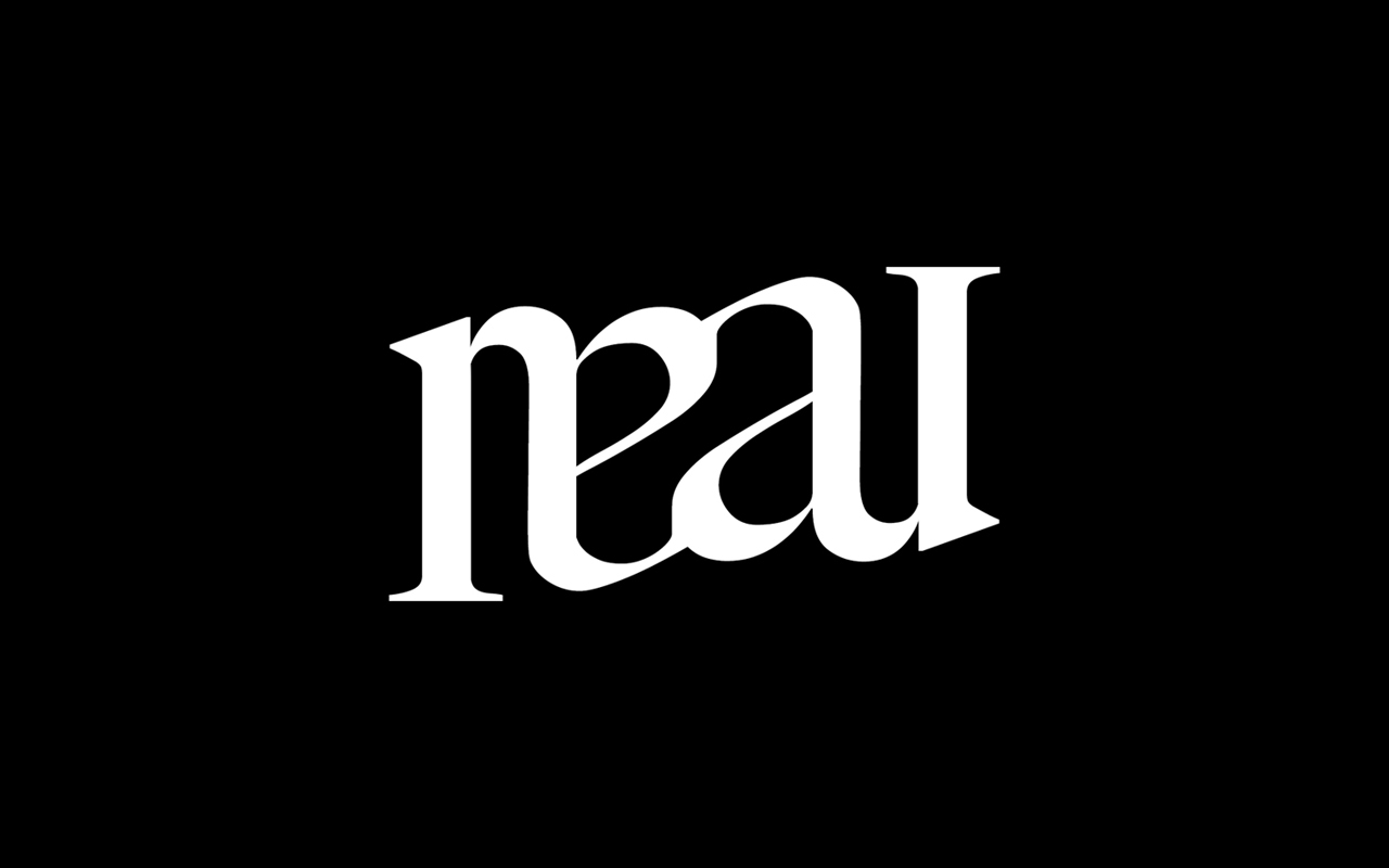
Ambigram
The neauoire Ambigram avatar is used mostly in forums, as an alternative to the 091450 icon. The design is taken from the complete Neau Ambigram, also found here.
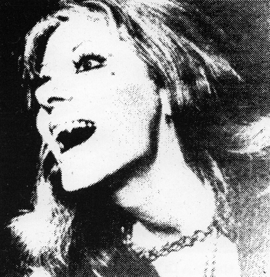
Carmilla
The Carmilla icon is taken from the 1995 cyberpunk magazine with the same name. This avatar is primarily being used on Mastodon and private channels.
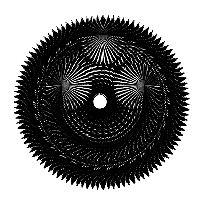
Orb
The Orb fractal icon was created in 2007 and has come to represent the Trisight, it is usually visible on the main portal page of this wiki.
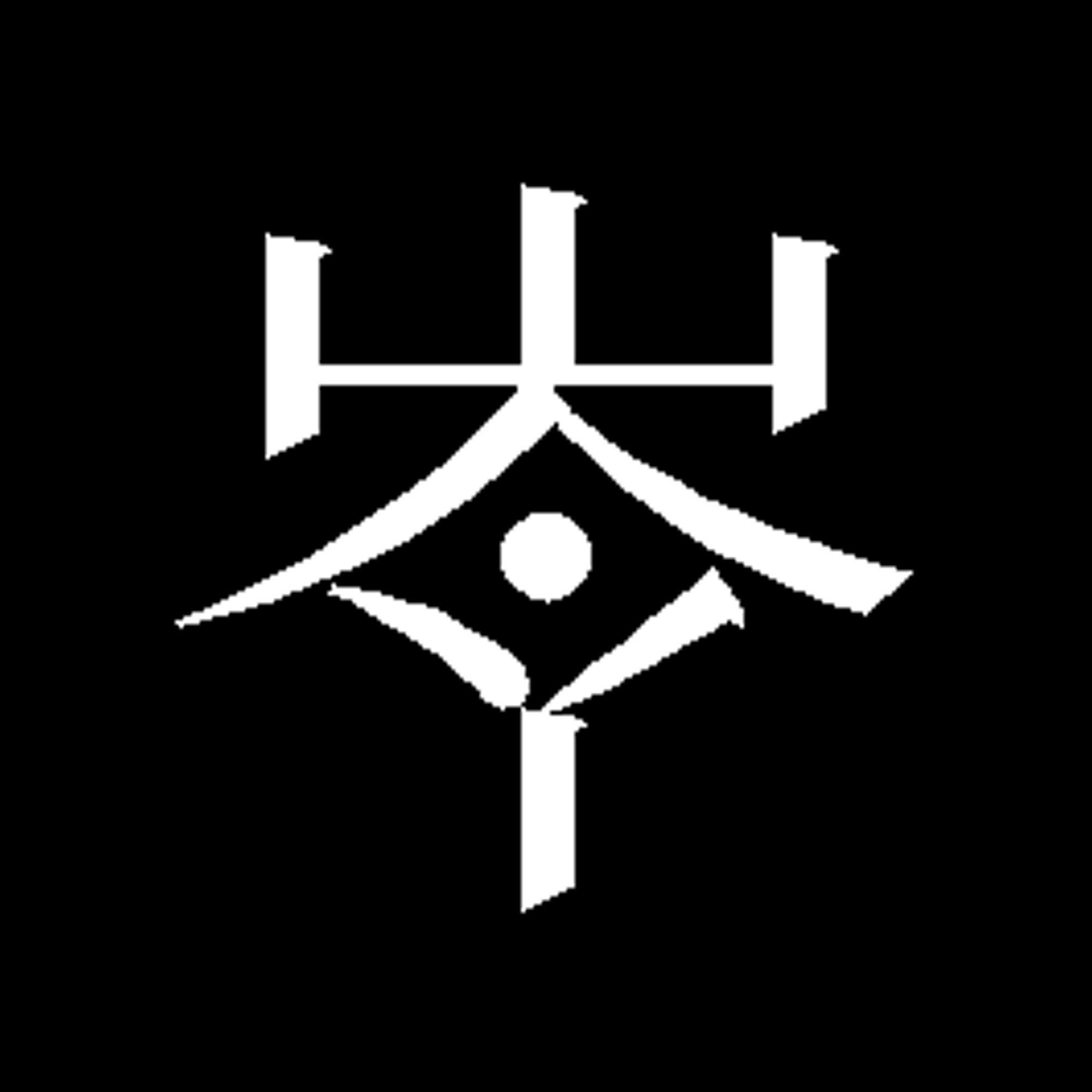
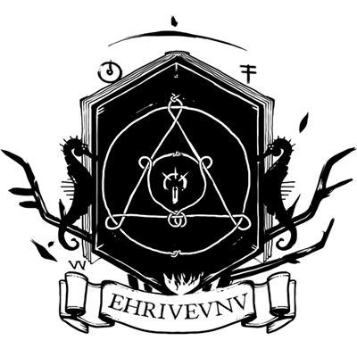
Crest
The Neauismetic crest features various elements found in the iconography of the Neon Hermetists. This icon is used mostly on official documentation, maps and charts from Dinaisth.
Lietal Glyph
The Lietal icon represents the relationship between the language's elementary constructs.
The Merveilles icon was created to mean the equalization of people through tooling, to elevate those in need or restrain those in power. It's a reference to the veil of ignorance.
XXIIVV 2026
Today's logo renders the letters xxiivv in a kind of penned, cursive conscript. By the time this one was made, the era of gradients and extrusion blendings has long passed, minimalism reigns supreme, logos reduced to simple black shapes without a single line that can't be justified to a board-meeting. So, I felt the urge to move away from all that and get something closer to some of the work I do today, and at the same time, find a way to express my love for cursive and analog practices.
In other words, the change was to go from a logo that can be written in a single stroke by a computer, to a logo that can be written in a single stroke by a person.
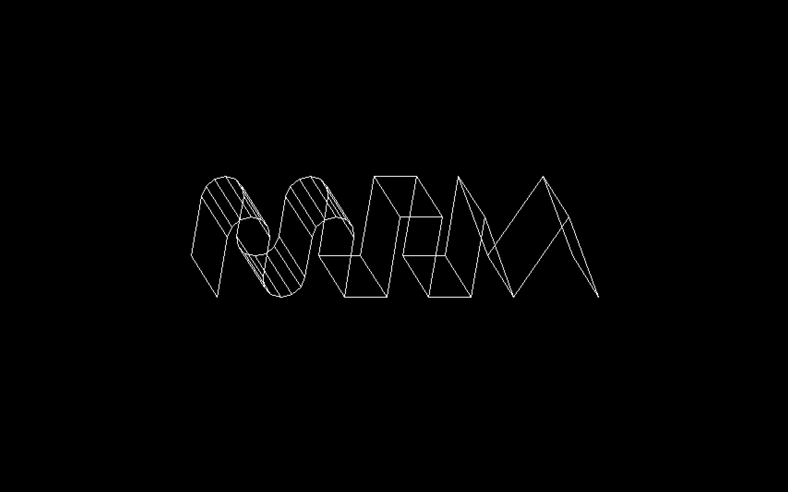
XXIIVV 2006
The logo represents three waveforms. Around the time this first XXIIVV logo was made, web 2.0 aesthetics were in full swing. Outer glows and shiny vertical gradients were everywhere. As a reaction to that trend, I tried to design the logo to be as stark as possible, without decoration and without texture. The goal was for it to be representable using only a handful of Bézier control points which aligned with my style at the time. The path definition for the svg version is as follow:
M 1,31
l 0,-22.5
a 7.5,7.5 0 1,1 15,0
l 0,15
a 7.5,7.5 0 0,0 15,0
l 0,-15
a 7.5,7.5 0 1,1 15,0
l 0,22.5 15,0 0,-30 15,0 0,30 15,0 0,-30 0.5,0 15,30 15,-30 15,30
The Symmetric Solresol Flag depicts the trough of a waveform at a ratio of φ, where each segment of the shape represents a Solresol letter in Sauso Ses, sol(𐑯) re(𐑦) sol(𐑯, mirrored).
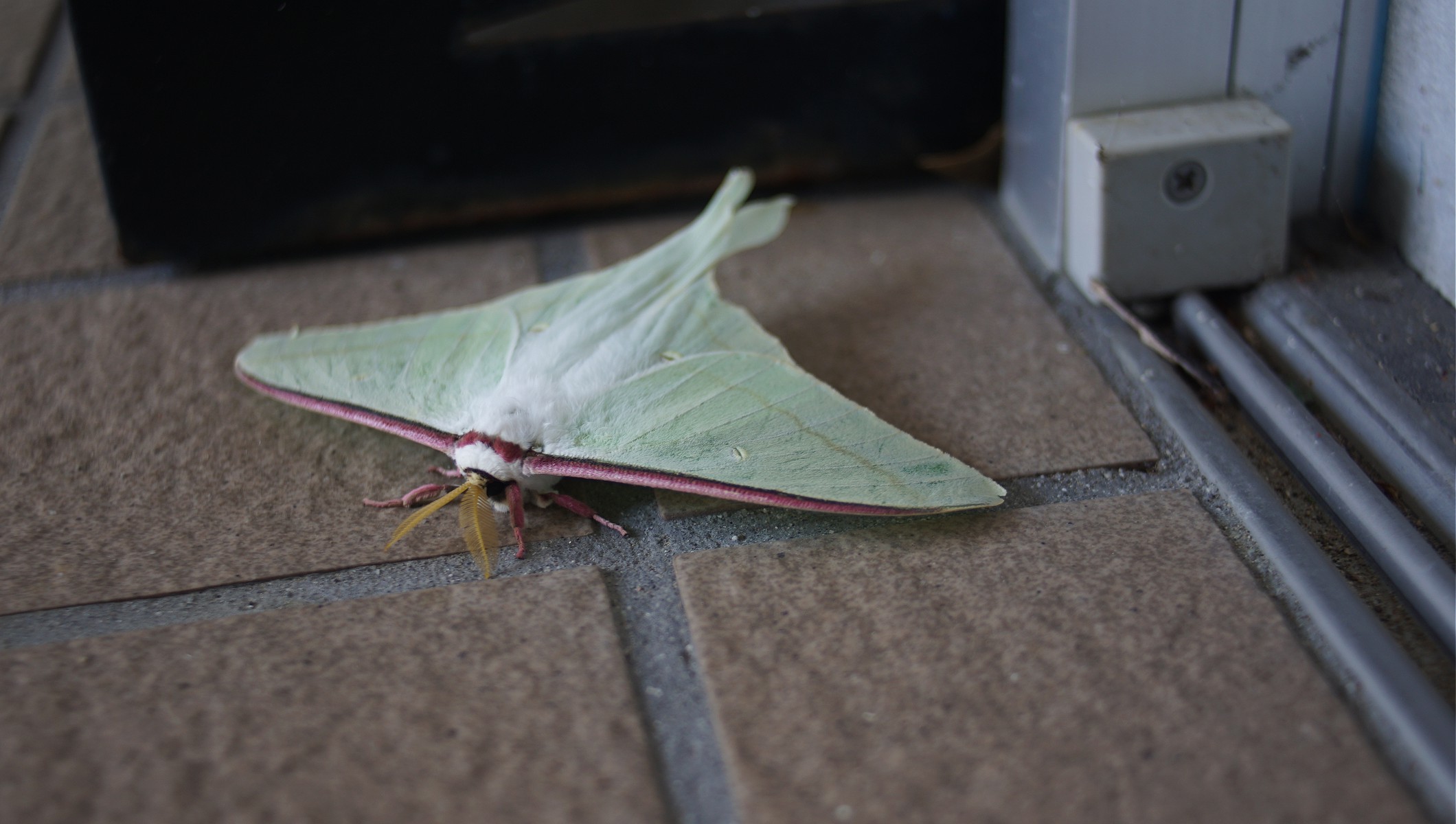
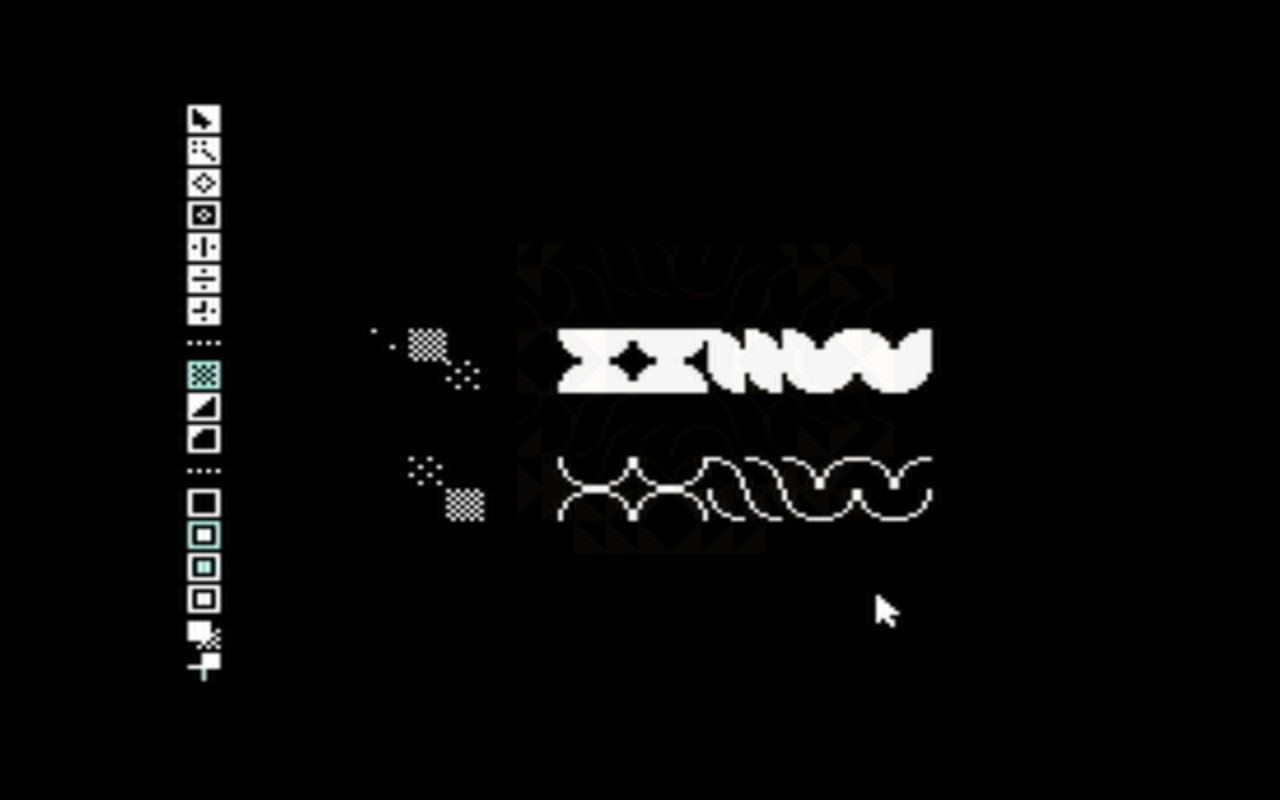
No, I don't hate color, on the contrary, I respect color so much as to not apply it frivolously.Luna moth in Minamiise14I08XXIIVV in NesPaint14B0972DEC2 Converses04D05


